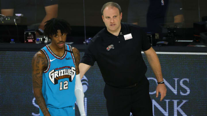
Among all of the chaos between the end of the Memphis Grizzlies season, the start of the offseason, and the exciting NBA Finals, a more simple debate has emerged on social media.
Who has the best retro logo in professional sports?
This was a question posed by ESPN on Twitter and Instagram, with a handful of logos in the running. These logos included but were not limited to each of the following.
- Vancouver Grizzlies
- Michigan Wolverines
- Houston Oilers
- Anaheim Ducks
A handful of other logos were in the running as well but those seem like the most iconic. Here was the original post by ESPN on Twitter.
https://twitter.com/espn/status/1418979296962560010?s=21
The Memphis Grizzlies retro Vancouver logo should be considered the greatest of all time with little resistance
If you’re looking for an answer as to whose logo is the best, it should be simple: the Vancouver Grizzlies.
The young franchise only existed for a few seasons and didn’t see a ton of success on the court. That said, their design team did arguably the best job in the history of professional and amateur sports, designing a logo that became an instant classic.
On the surface, the logo doesn’t seem like anything special. A Grizzly bear holding a basketball in his clutches with sharp bubble letters spelling out “GRIZZLIES” above his head. Somehow, however, this just works.
Perhaps it’s the fact that the color scheme is completely unique to anything that has been done in recent memory. Teal is not one of the more popular colors around, so it was a bold move to go with it for this OG logo. They would pair this with a warm brown and an orange basketball to complement it. It all paid off.
That said, the modern retro Grizzlies logo tends to veer away from these original colors, implementing a color on their throwback jerseys that mimics a more sky-blue feel. While nothing will beat the original color scheme, this logo makes just about anything look good.
In fact, the Memphis Grizzlies have a great track record of making almost every uniform combination that they release look good. Hopefully, their future uniforms will follow this trend.
Even though there are some other iconic logos on the list, nothing really comes close to this one. If you disagree, join the debate on Twitter.
